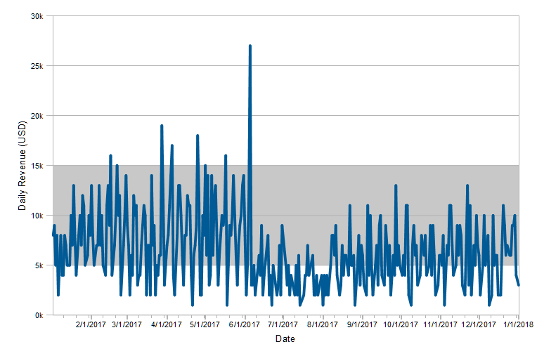
The usage is exactly the same in charts as it is in gauges. This new feature can be used e.g. to highlight x-axis areas if you want to draw the attention to a certain part of the chart. Take the following chart as an example. It shows the revenue per day throughout the year 2017.
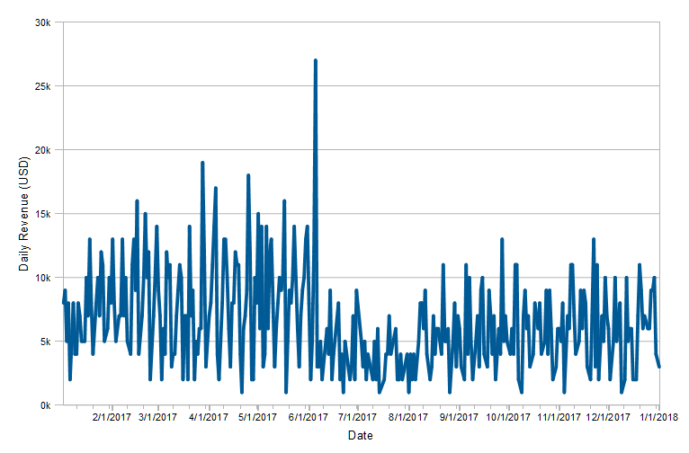
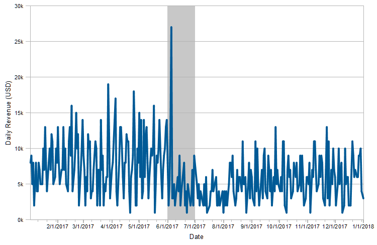
See the spike in June? In this case, the company had offered a special deal during the summer. Now let’s highlight the area of the chart where this offer was valid. Simply add a new signal range on the x-axis for the time in question. The limits for the area could also be determined by formula or variable. And you can have an arbitrary number of signal ranges in your chart.
The resulting chart looks like this – you can now clearly see that the offer was a huge success initially, although you might have cannibalized sales later in the year.
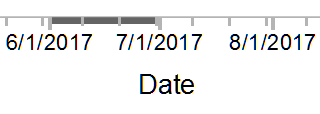
If you prefer, you can restrict the signal area to the axis region instead of the chart itself. So changing the appearance and color – of course all freely configurable – you get to this (closeup):
The same works for the y-axis as well, e.g. to highlight the targeted revenue band:
If you want to get really fancy, you can even combine both features. This offers powerful new visualization options that both help with the readability of your charts and add meaning to your data.

Leading the development at combit as Managing Director. Microsoft .NET enthusiast driving innovation & agile project management. Used to be a physicist in my first life. I love hiking and vanlife.